When your goal is to grab attention and keep people interested, at what point do brand guides become brand gags?
When you hear the term Brand Guidelines, it might well conjure thoughts of a dense document filled to the brim with every definable brand asset, shown in every possible iteration, maybe introduced via an inspiring manifesto. A good brand guide is able to crystallise a brand’s attributes – values, purpose, a shorthand to consistency, visual tone, messaging…
But then, there’s that point where the values and vision section ends, inspirational brand-speak stops, and a rigid functionalism begins. From here on in, the guidelines are less guide, more explicit directives. Rules and restrictions. Limitations and thou-shalt-nots
What if these heavy-handed ‘do’s and don’ts’ were the very thing restricting brands from expressing their true potential? What if we invested less time creating technical parameters, in favour of greater conceptual and creative guidance?
It’s starting to happen already. From small business start-ups to well-established brands, businesses are pulling away from cumbersome brand guidelines and adopting super-iterative, flexible, responsive and ultimately more human ways to show up in the world.
True creative director Matt Heays says “Many of our clients are discovering a more flexible and responsive guideline is, in the right hands, far more useful than a rigid set of rules.”
For example, our friends at AJ Hackett Bungy NZ have taken a bold approach to refreshing their brand guidelines. By slashing many of the functional rules from their guidelines, they’re creating space for continued creative evolution and innovation – an approach that is entirely in keeping with their brand personality. As Matt points out, “Nobody told AJ he couldn’t wrap bungy cord around his ankles and fling himself off a bridge, so why would they have a guideline that says no one can use orange in a headline? They’ve made decisions to sit at the end of the far end of that spectrum with where their brand is headed. After all, they’re a brand bornout of an activity that was basically deemed illegal. It almost seems absurd they even have brand guidelines.”
An obsession with single-mindedness can stifle a brand’s ability to show up in the right ways and attract new customers - even if it can seem like an easier approach. Flexibility doesn’t have to mean giving up consistency. It’s just about carving out a greater space to play. “That little extra flex is often the path to finding deeper, richer creative opportunities”, says Matt.


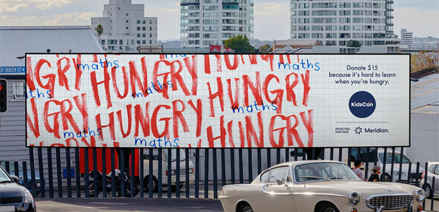
The new campaign for KidsCan by The Monkeys is a great example of a less rigid, more multi-dimensional approach to storytelling. “The KidsCan campaign is a standout example of drawing from a wider palette, where each execution feels perfectly crafted for its placement, and any ‘rules’ they’ve created are invisible – as they should be. No one wants to see your template showing.”
Of course, it’s highly likely that 100-page guidelines decks will have to stay in play for certain brands and categories (big banks, we’re looking at you). But the days of the great big ‘Brand Bible’ intended to last for five years could be numbered, especially if they’re preventing brands from evolving with the times.
We’re having more conversations with our clients about the need for responsiveness - how does your logo move, what’s its most reductive form, what do the elements look like when animated? Thanks to the sheer number of assets we need to produce, responsiveness has become fundamental to future brand success. And increasingly, digital brands are moving from a pdf of guidelines to an asset library that lives in places like Figma, and is deliberately built to encourage collaboration, iteration, and prototyping.
We’re excited by this future where brand guidelines can become less about protecting and prohibiting, and more about inspiring and enabling. What do you think? We’d love to hear your thoughts.
