


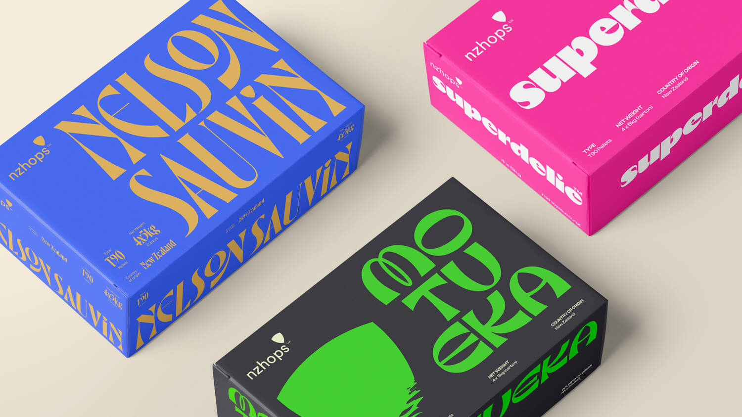
NZ Hops is a cooperative of master growers from the Nelson region, with over 150 years of experience. They needed a brand identity to reinforce their rightful position as innovative industry leaders.
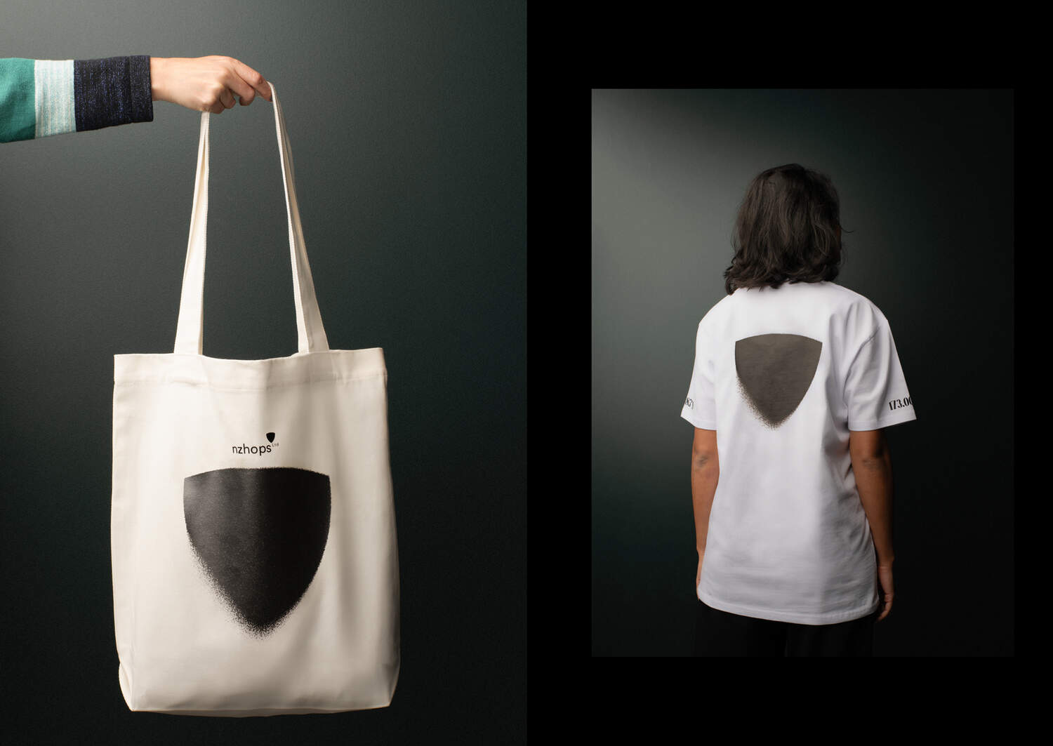
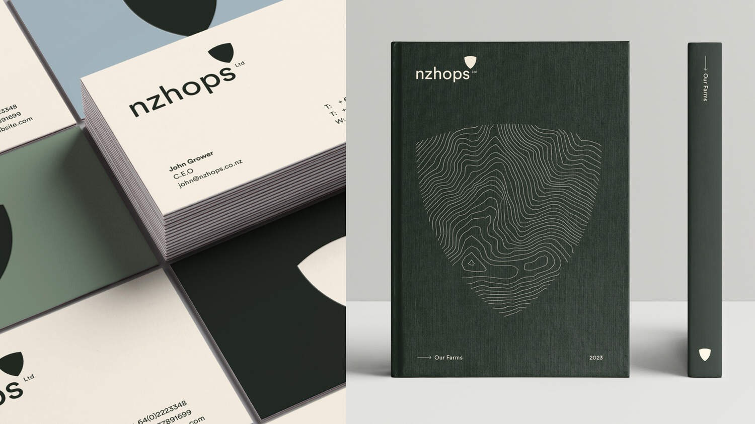
Our eyes turned to the bract. It’s the part of a hop that acts as a shield by interlocking with other bracts, protecting the aromatic magic beneath the shell.


It’s a perfect metaphor to describe the New Zealand Hops cooperative - a group of growers, coming together to nurture and fiercely protect the magic they’ve cultivated for over a century and a half.
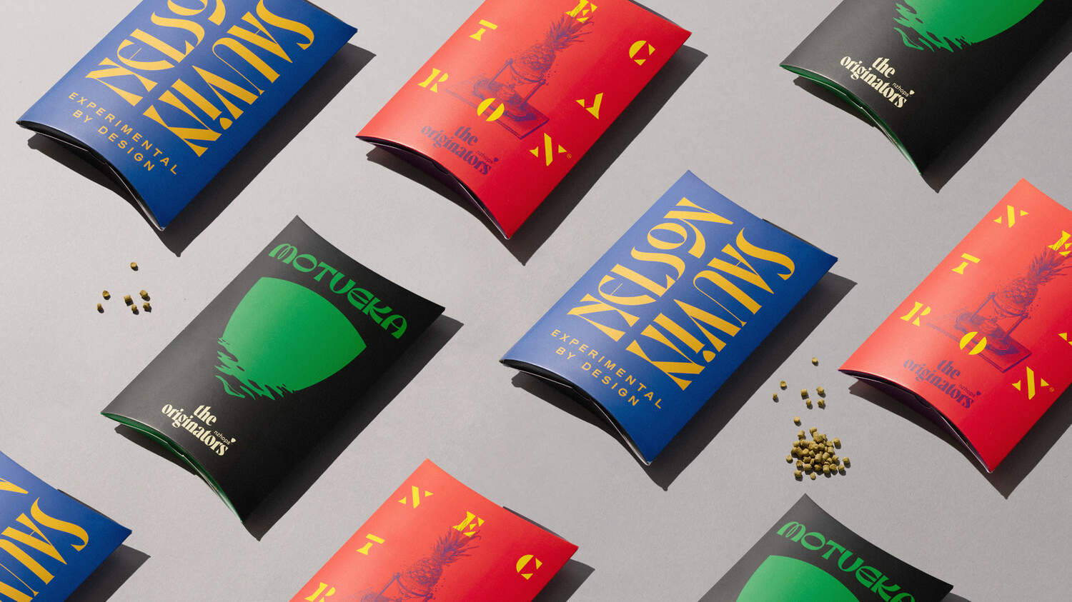
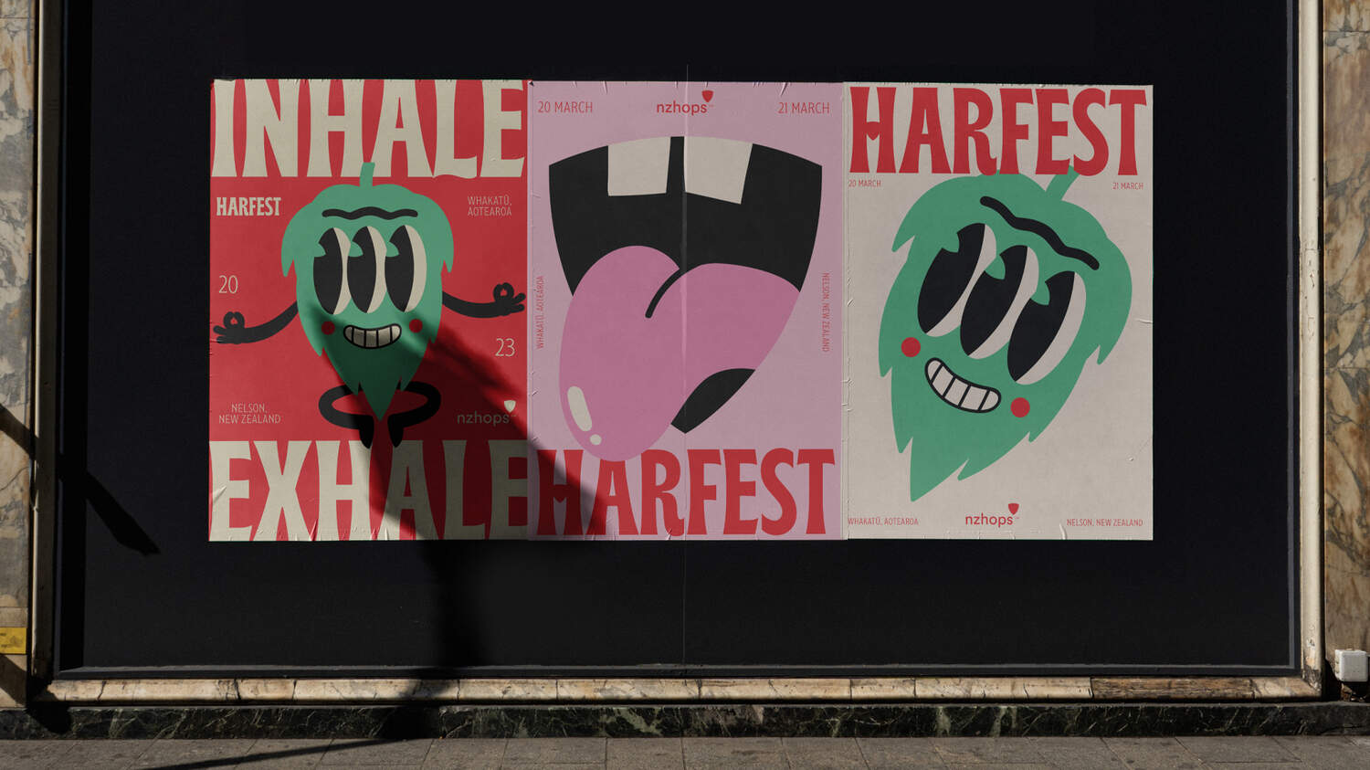
The shield-like profile talks to the brand's strength and tenacity, but also speaks to the heraldry of past ancestry. While the refined, cleaner-lined form speaks to innovation. The Bract is flexible, easily identifiable on packaging and B2B collateral, and looks great when motion is applied.