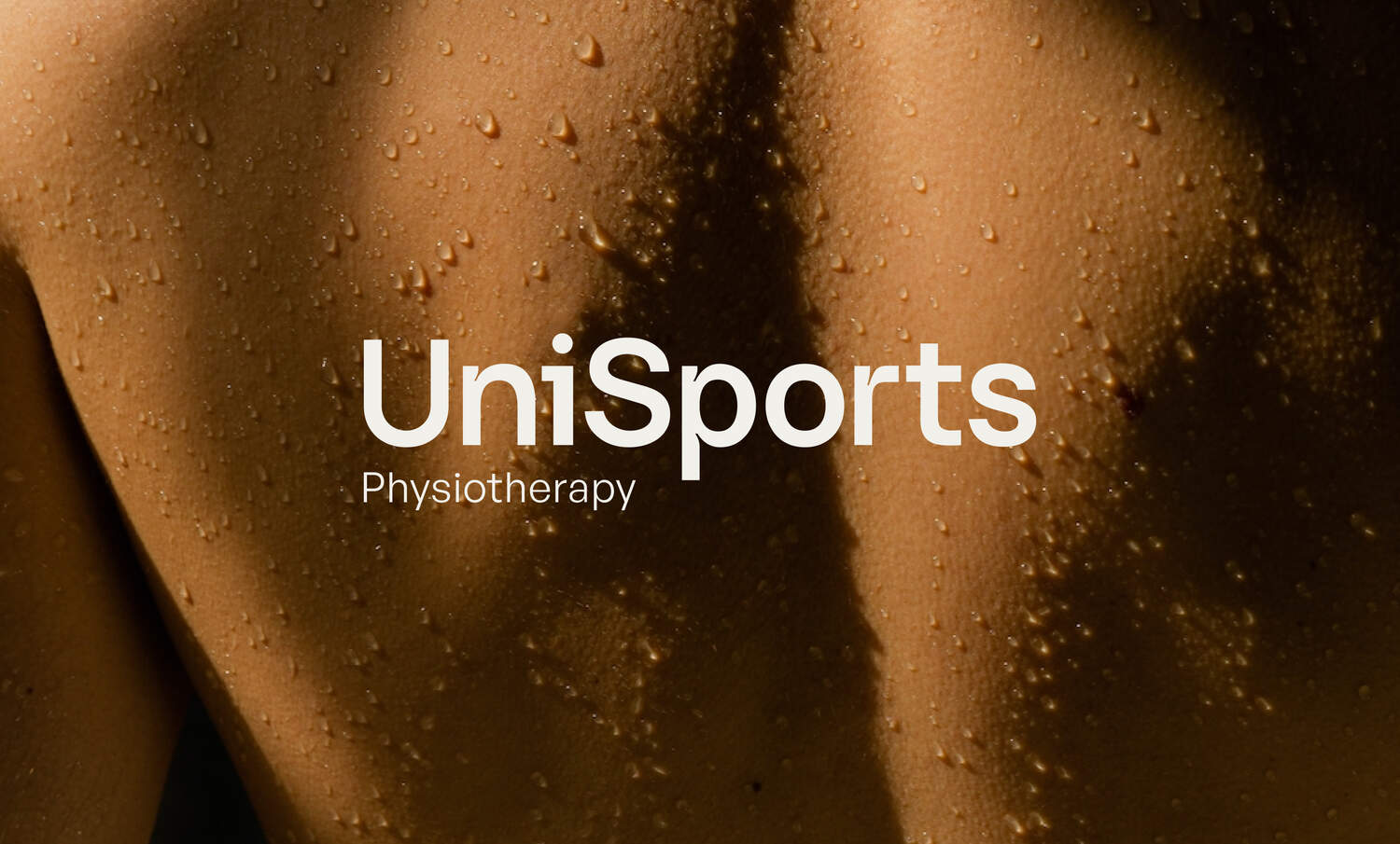
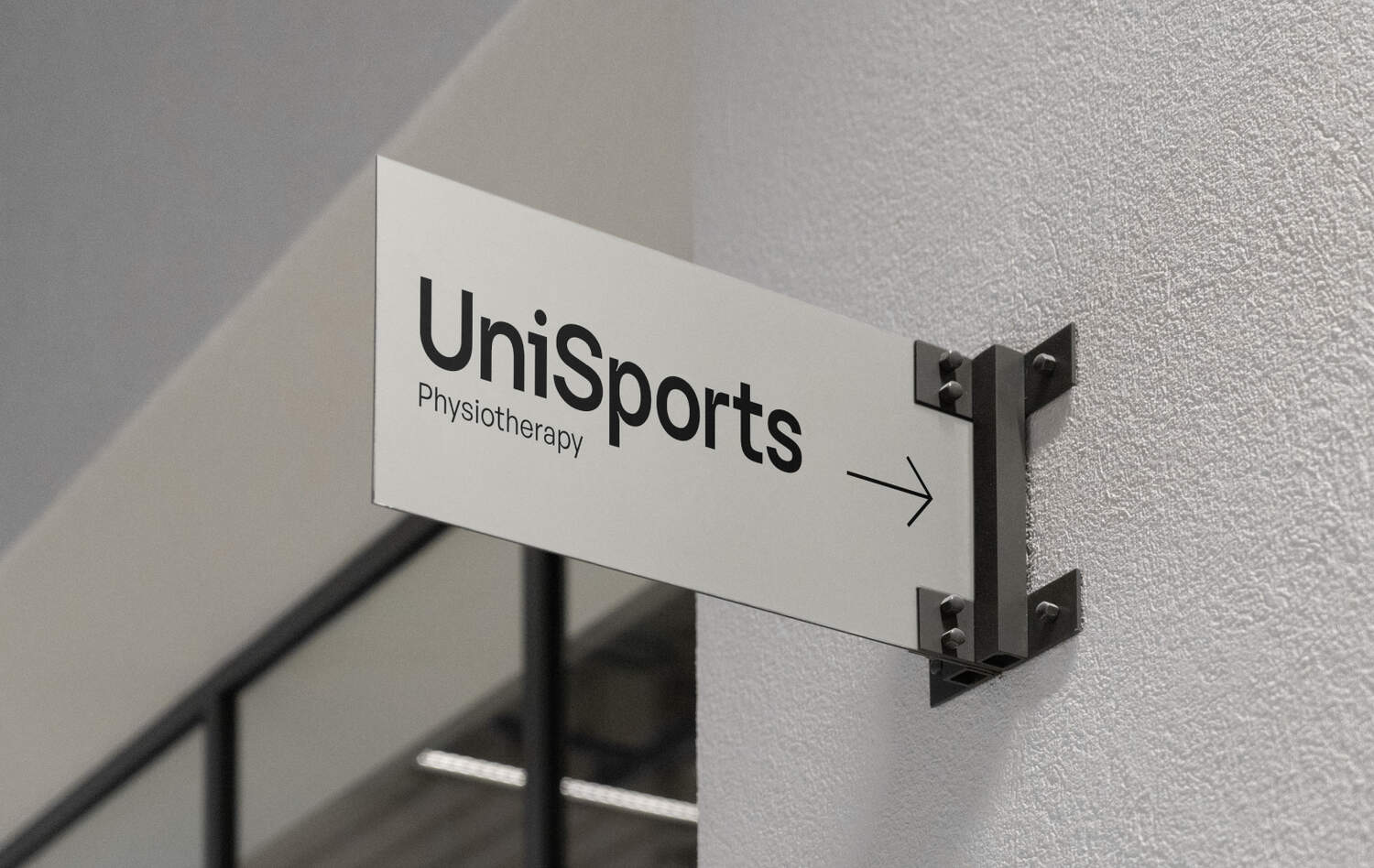
Unisports – massaging new life into a physiotherapy brand.
Unisports has been providing physiotherapy services to Aucklanders for 30 years. Their approach is always person first, injury second. We worked with them to develop a new brand identity that focussed more on positive outcomes than injured patients and health industry tropes.
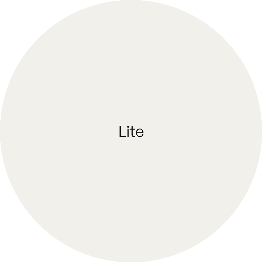
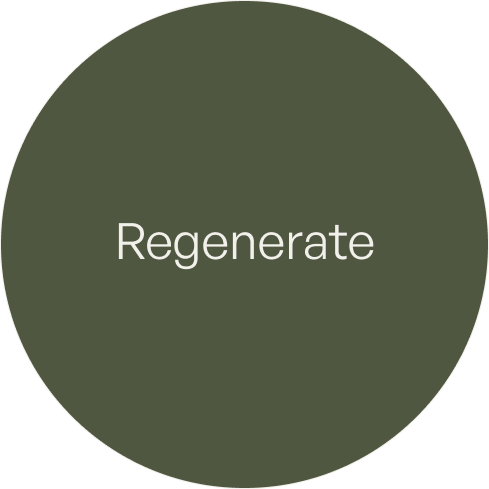


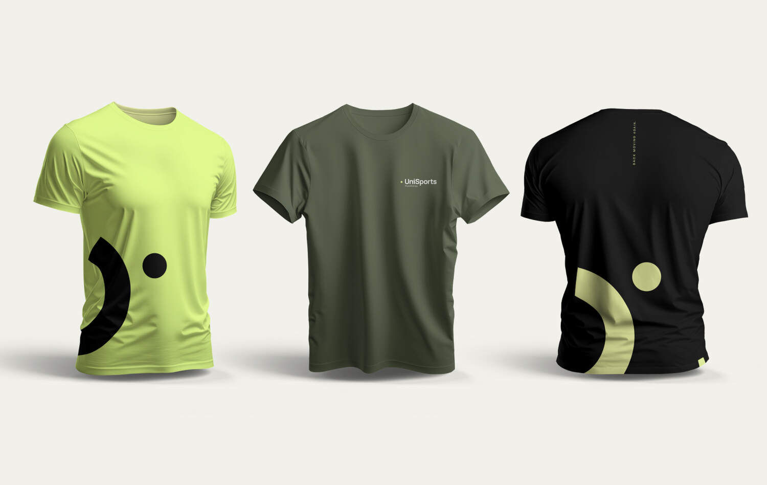
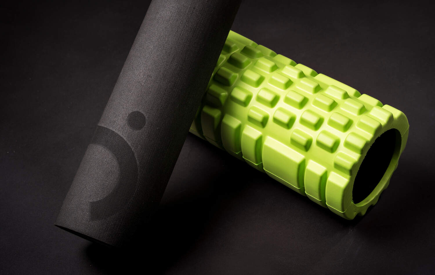
Our colour palette for the brand was more sports, less therapy.
Gone were the sterile blues, replaced with sporty black-and-white, with pops of green to bring in touches of nature.
Our logo typeface features inktraps that feel organic, like intertwining muscles and ligaments. Paired with a circular motif, it’s all about the feeling of regeneration and regrowth.
And the new photographic approach featured people living life to the fullest, rather than in pain or treatment
PERSON FIRST, INJURY SECOND. PERSON FIRST, INJURY SECOND. PERSON FIRST, INJURY SECOND. PERSON FIRST, INJURY SECOND. PERSON FIRST, INJURY SECOND.
PERSON FIRST, INJURY SECOND. PERSON FIRST, INJURY SECOND. PERSON FIRST, INJURY SECOND. PERSON FIRST, INJURY SECOND. PERSON FIRST, INJURY SECOND.